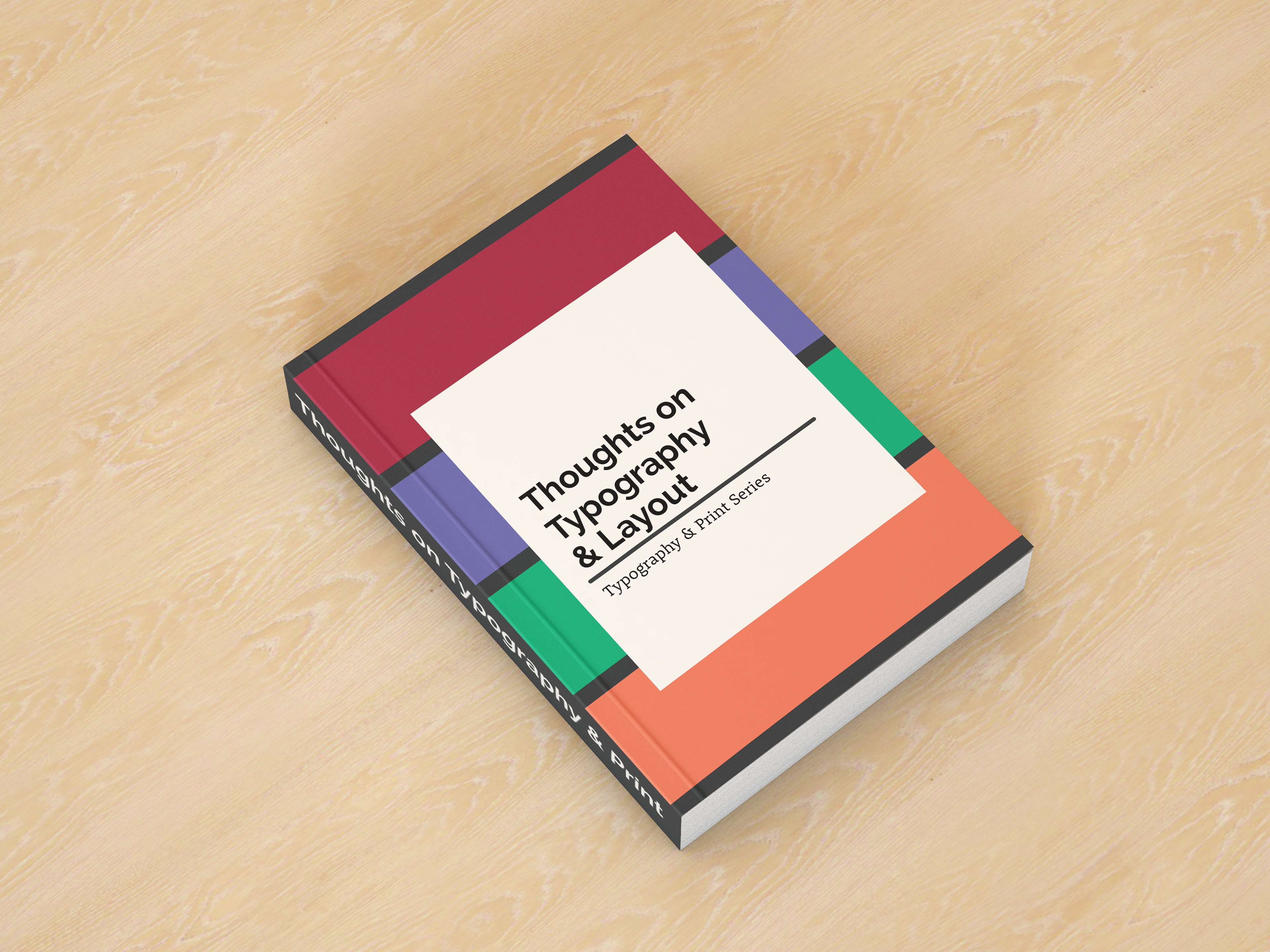
The front cover of the finalised book. The coloured strips as you can see reflect the colours used to denote each essay.
'Thoughts on Typography & Print' is a collection of short essays & extracts discussing the theme of typography and page layouts by acclaimed typography & design writers.
This project was completed as one of my major assessment pieces at Griffith University.
Students were tasked to design and typeset a book based on these essays and carefully select the most appropriate fonts to use in the book that would best match the theme of the essays and extracts.
Students were tasked to design and typeset a book based on these essays and carefully select the most appropriate fonts to use in the book that would best match the theme of the essays and extracts.
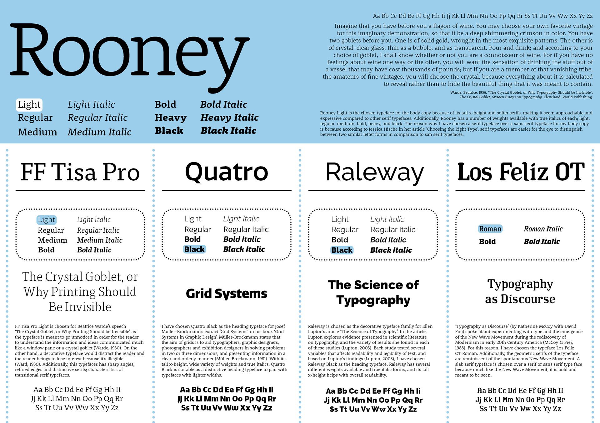
The A1 type specimen poster that was created to present my justification on the fonts chosen for this project. Rooney Light was chosen as the main body typeface, then four different typefaces were chosen for each of the four essays that were provided.
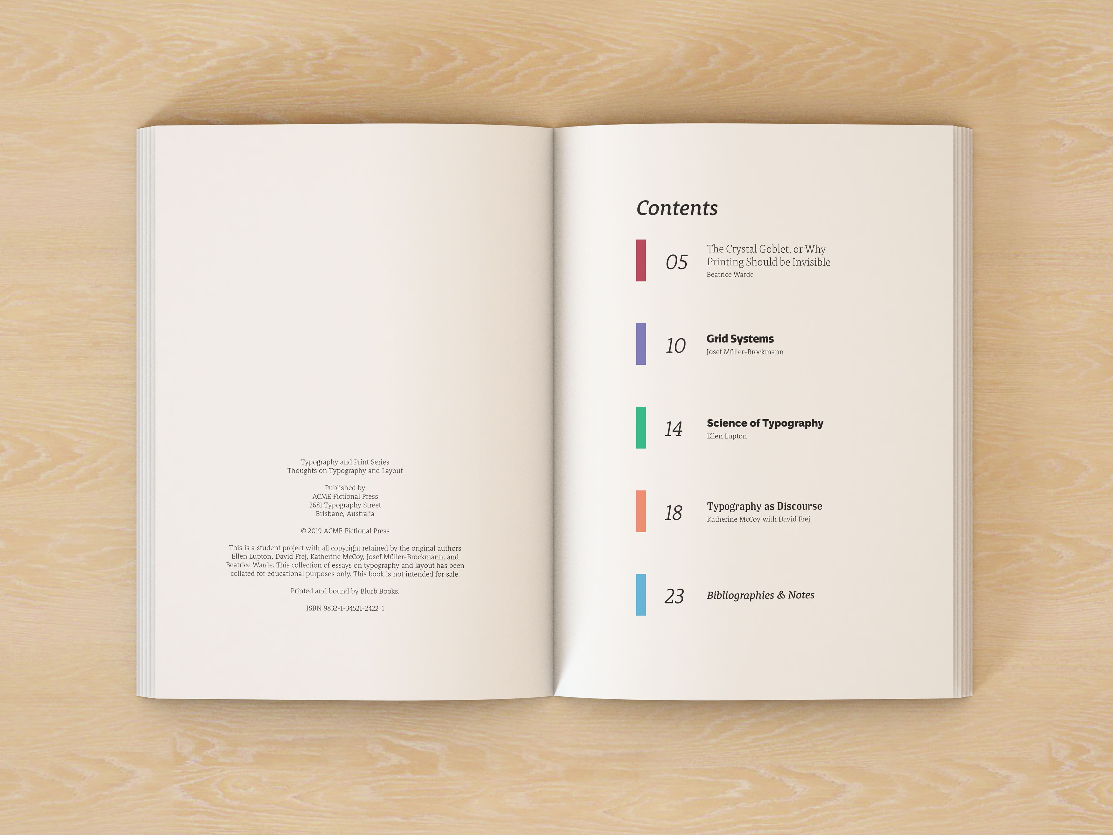
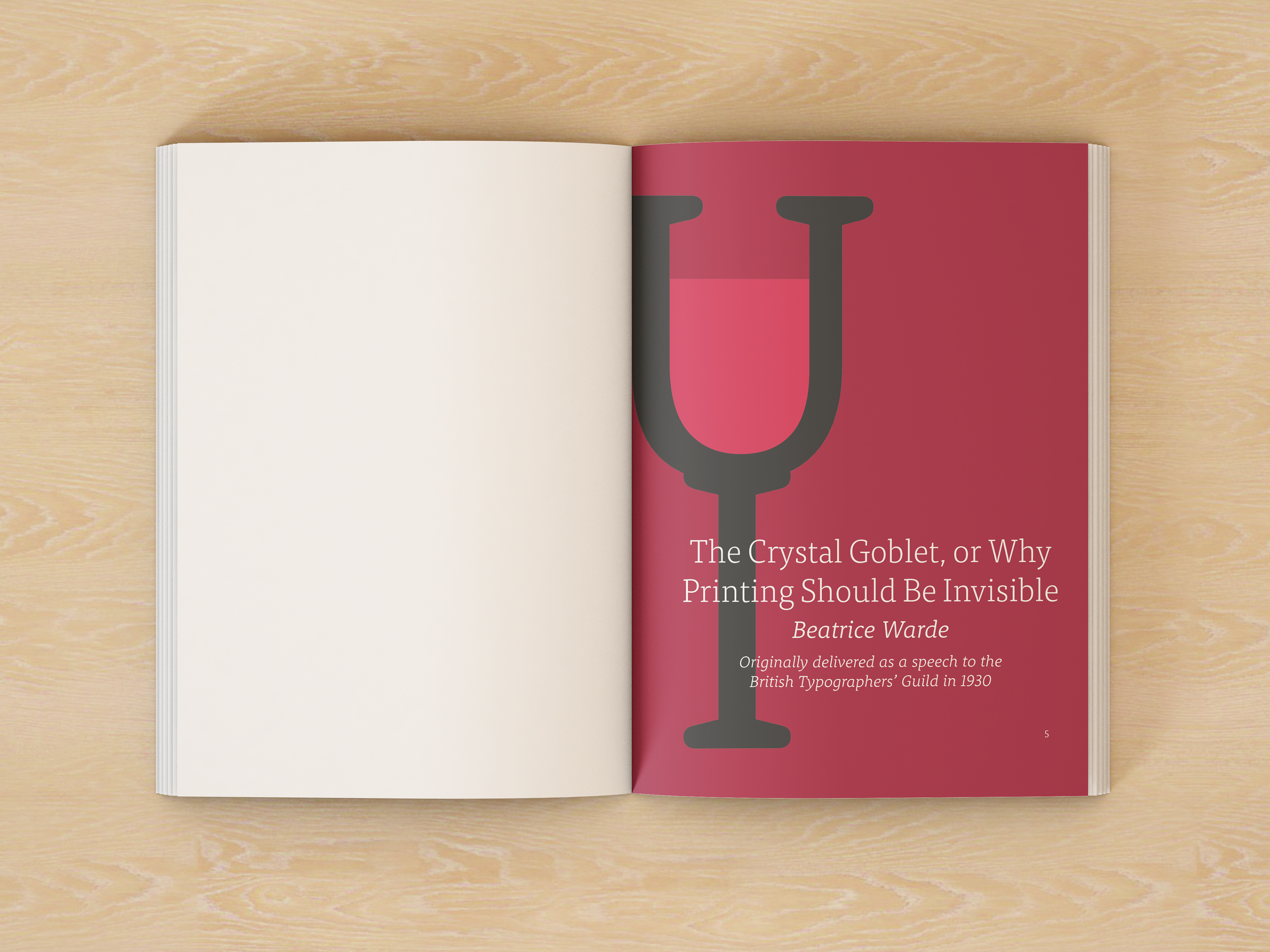
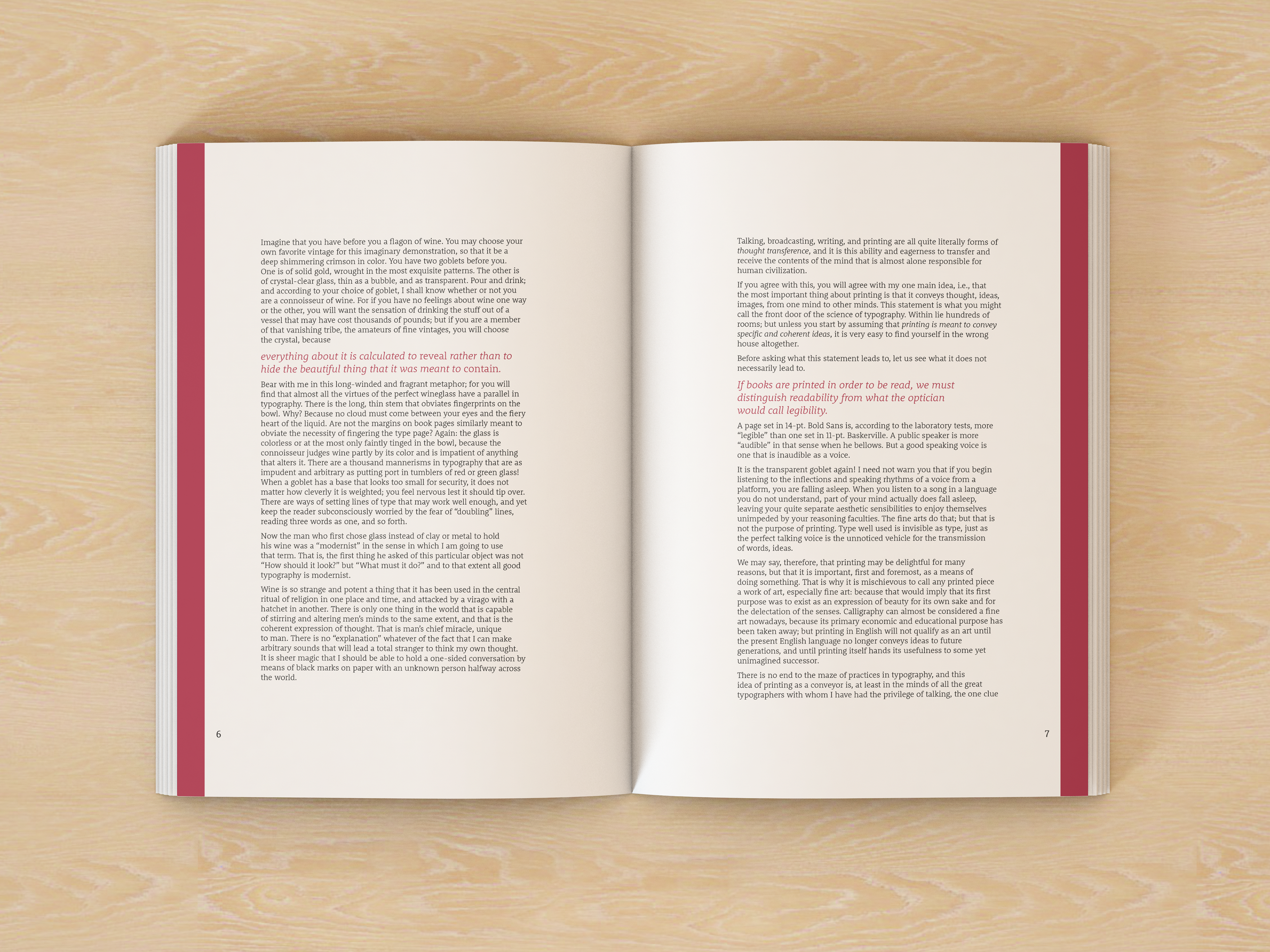
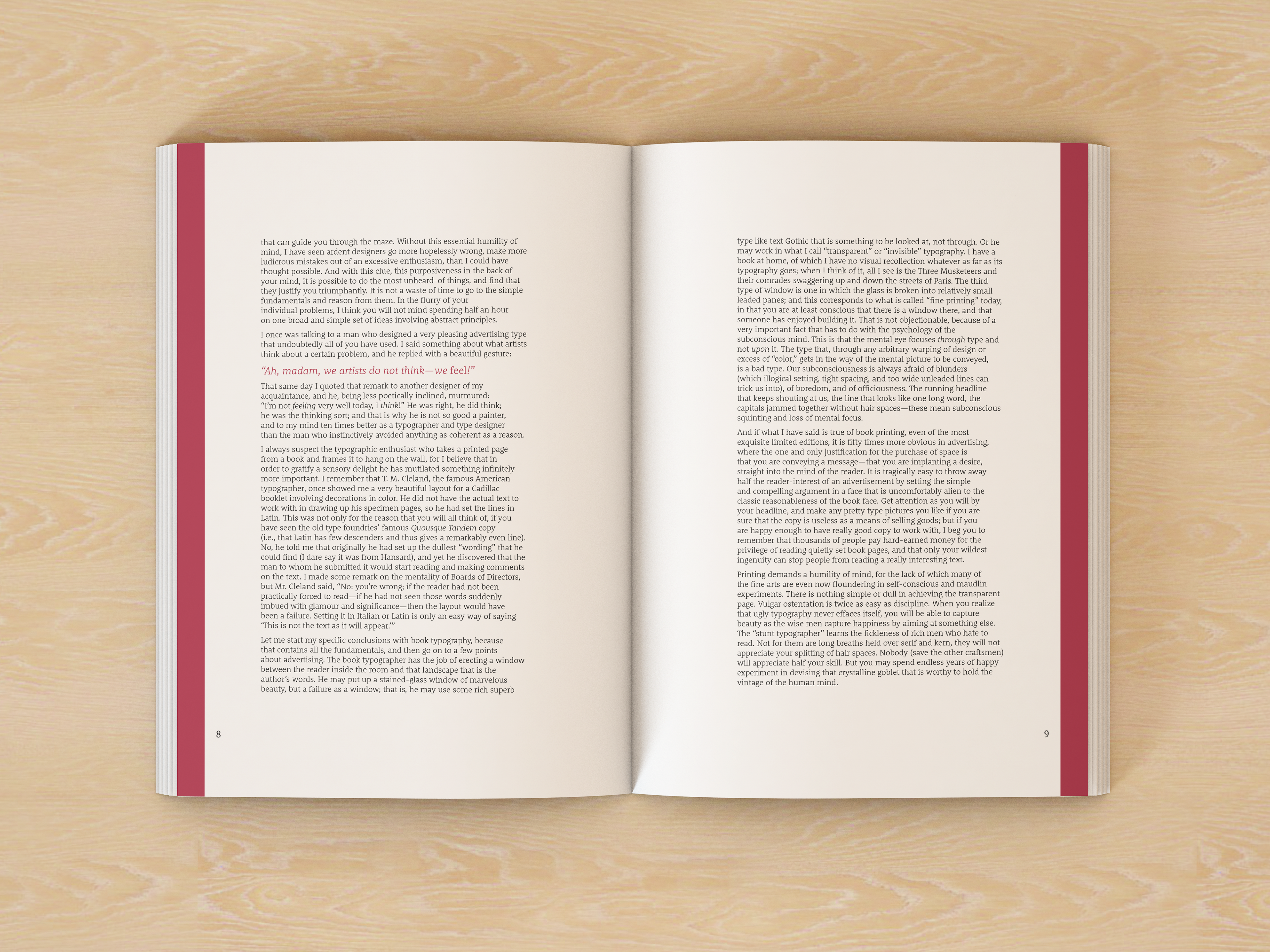
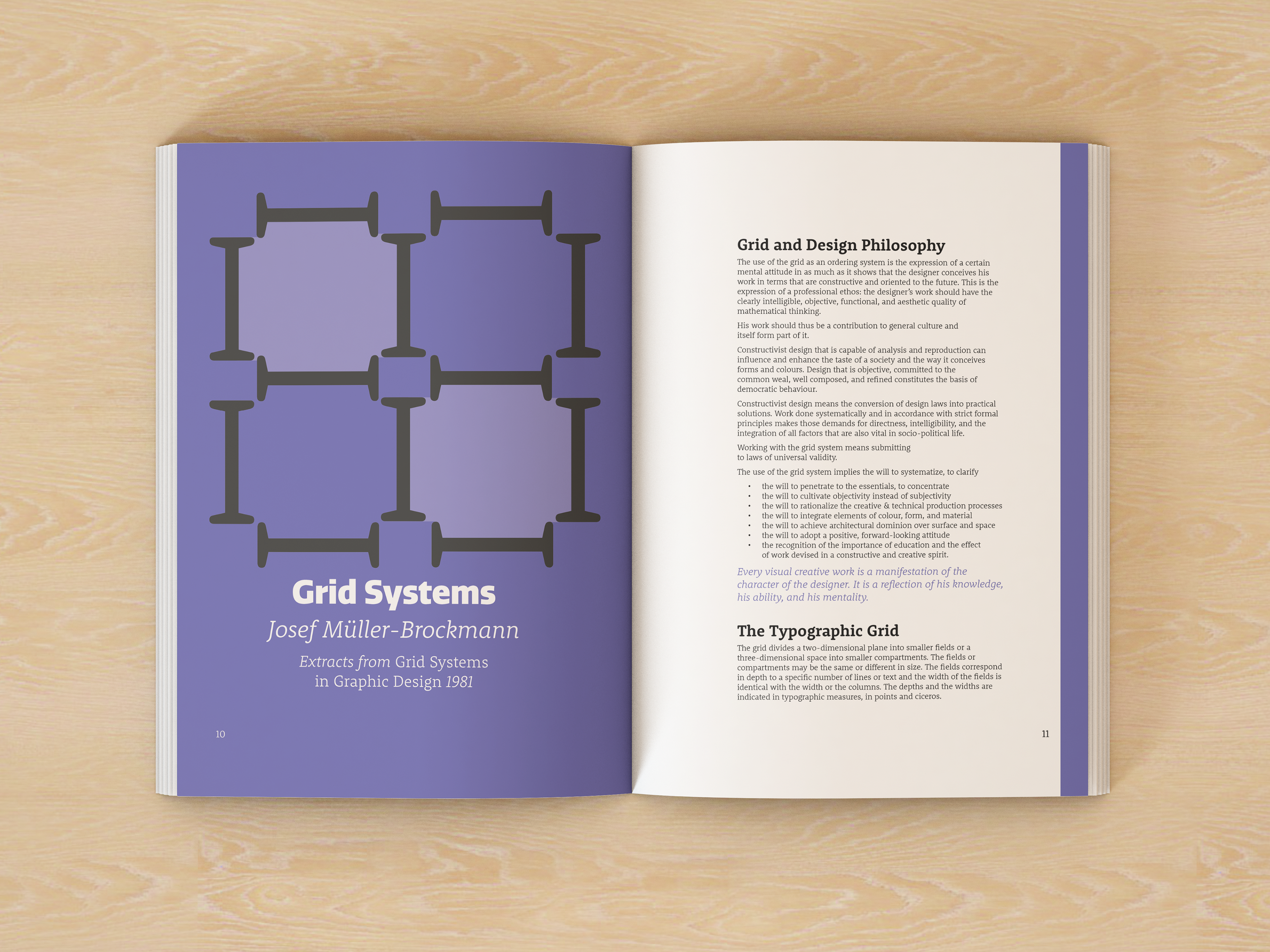
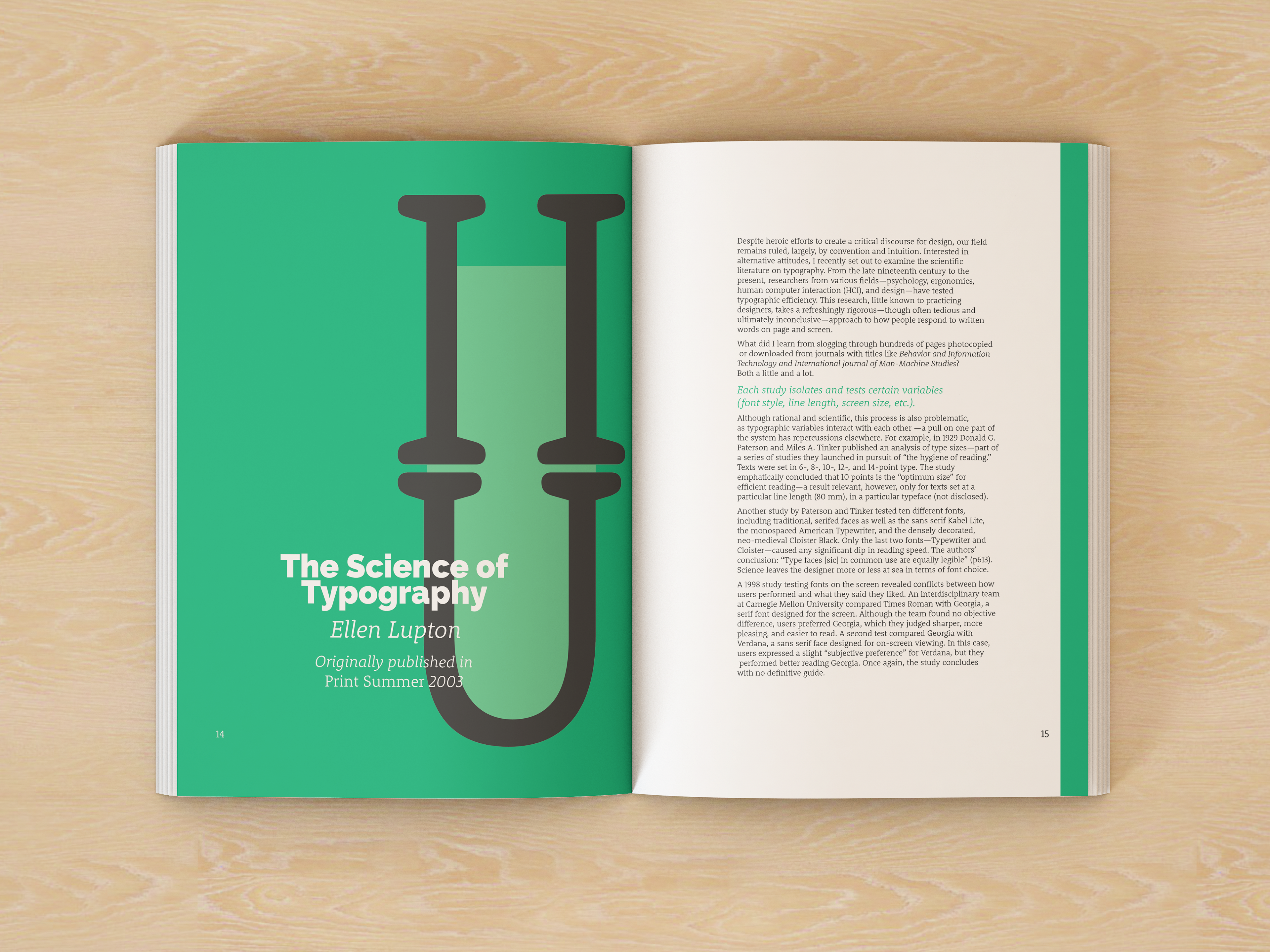
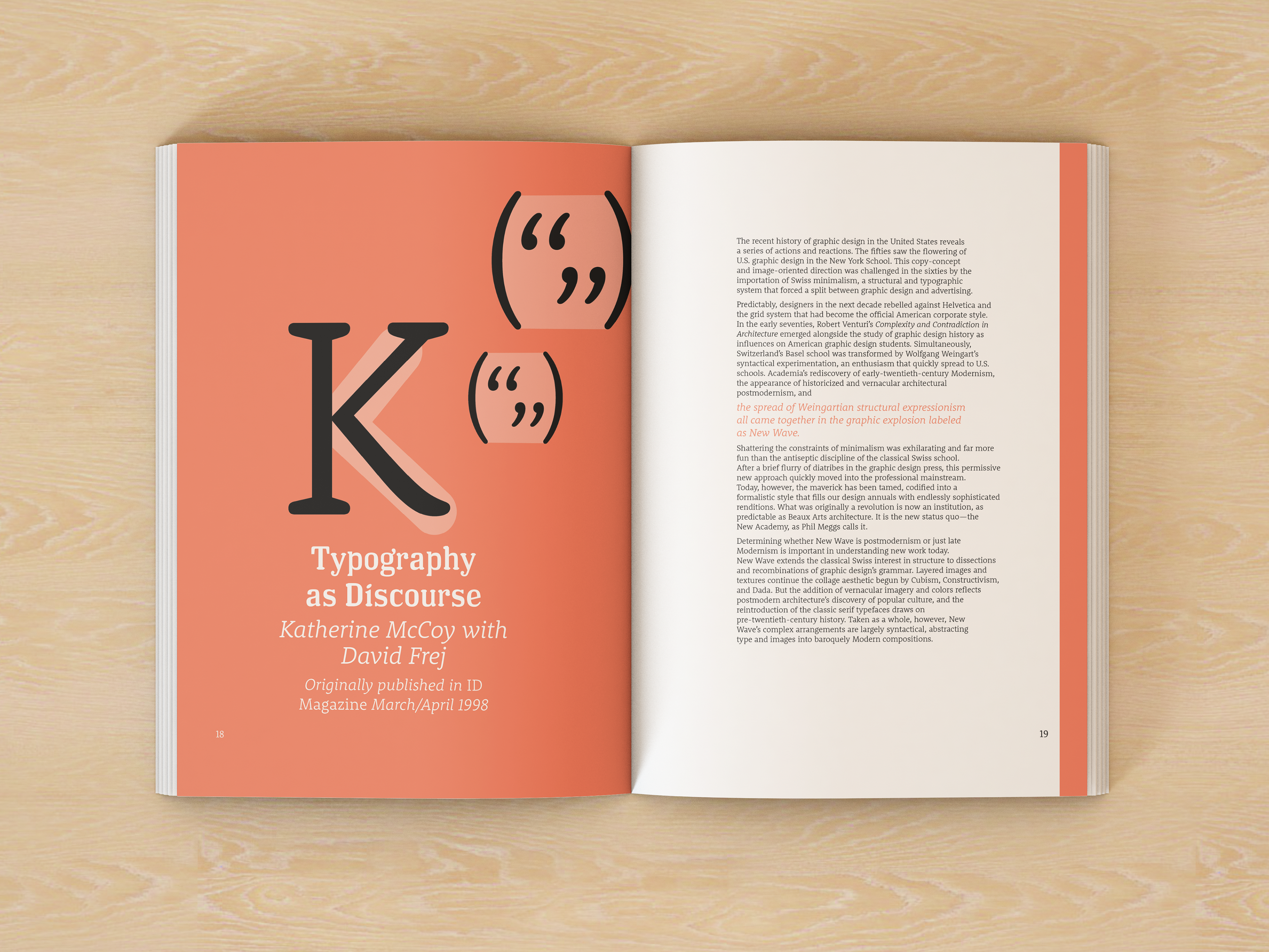
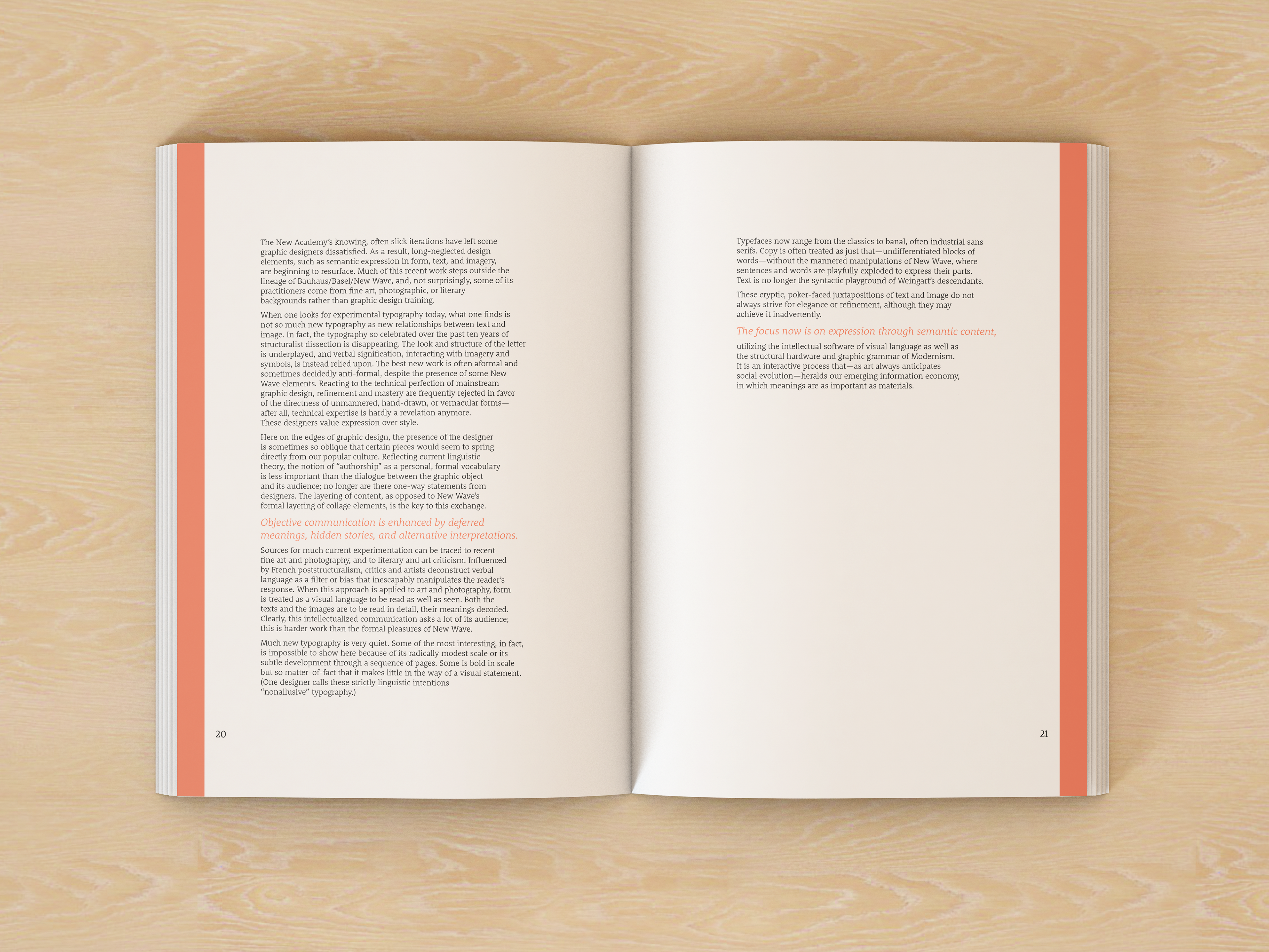
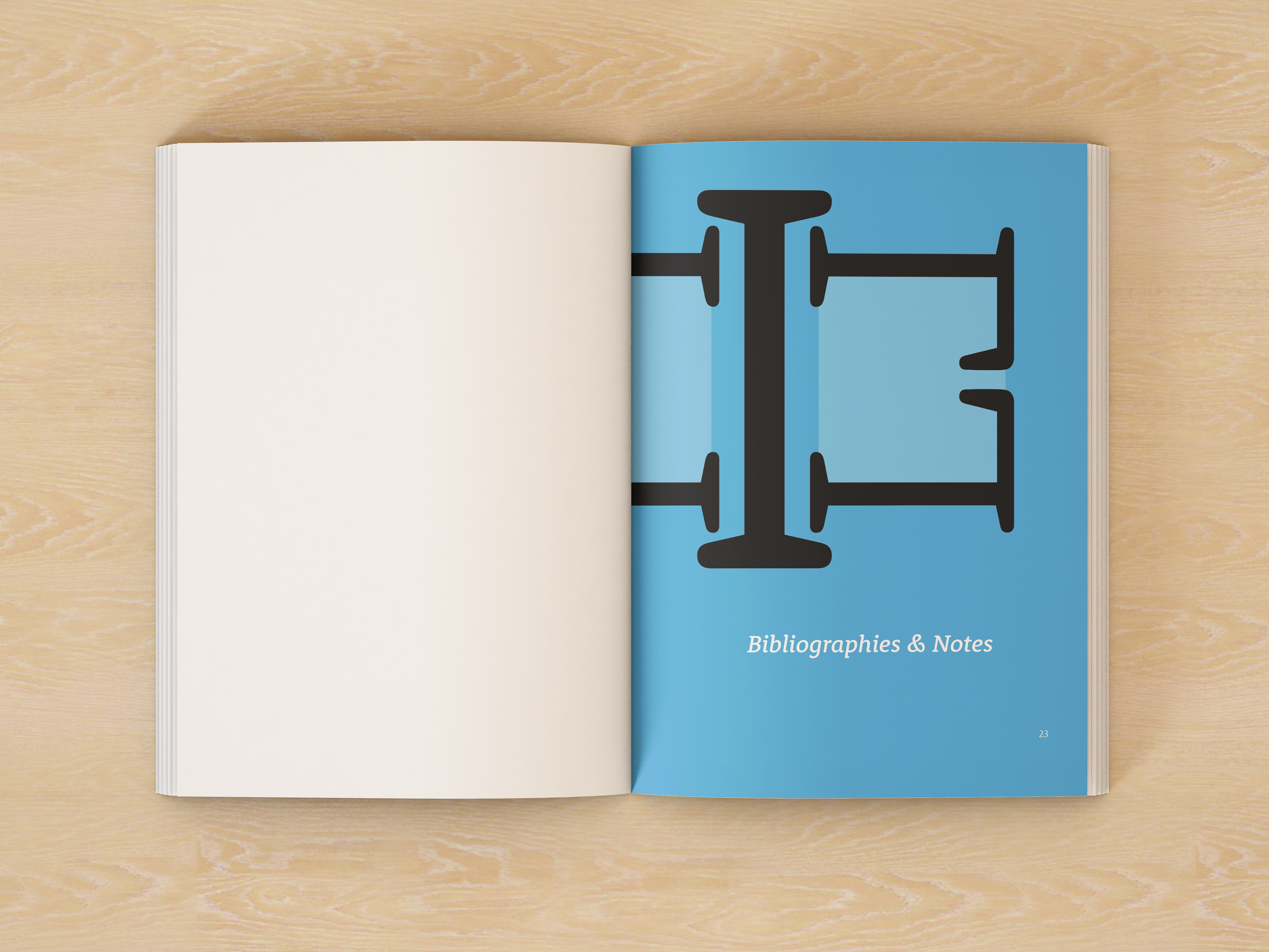
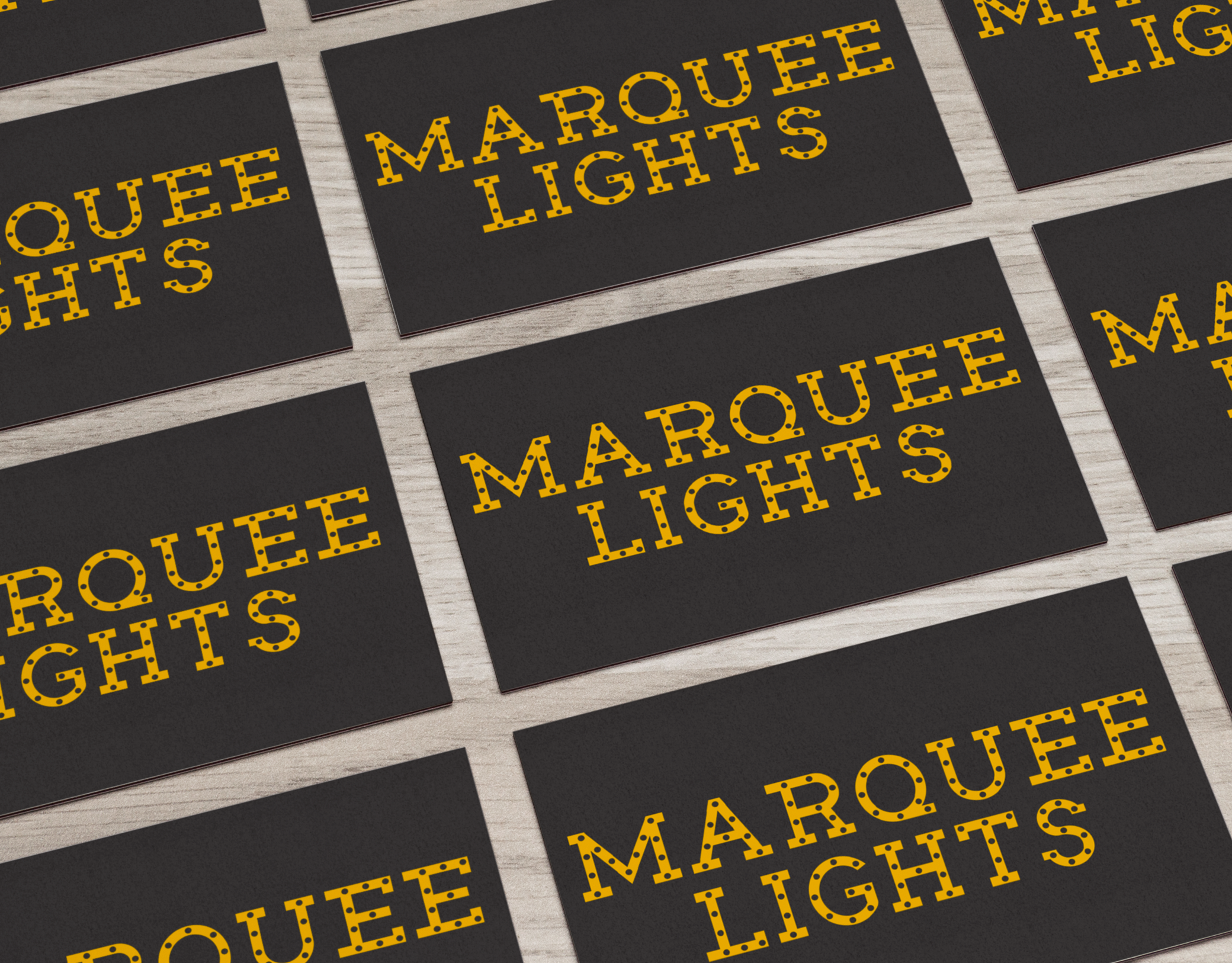
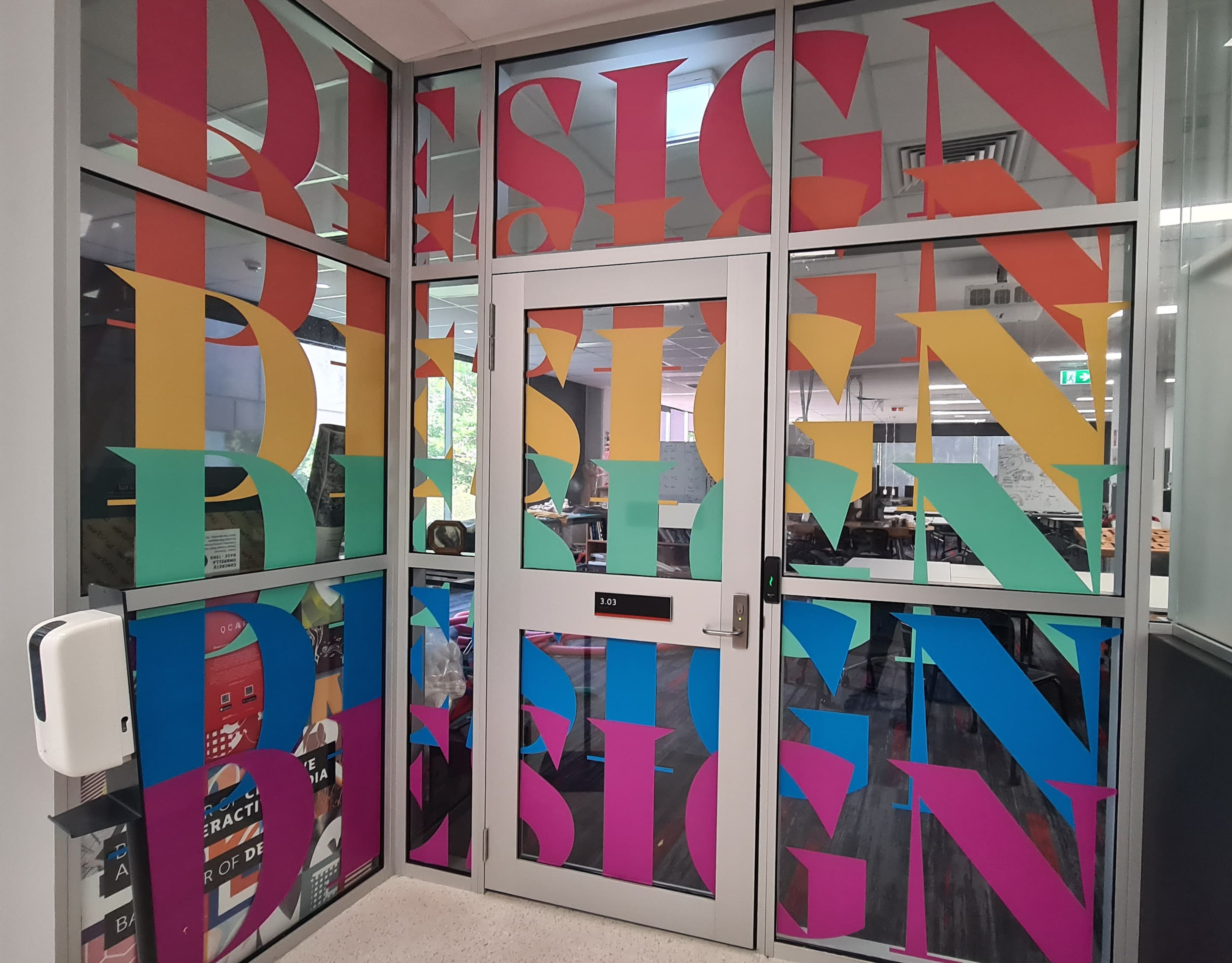
The images below show all the typeset pages for all the essays. Here, you can see that a colour has been assigned to each chapter and an image has been created from individual letters that best represent each essay. Additionally, pull out quotes in the allocated chapter colour have been use to place emphasis on particular lines and add some more pops of colours to the pages.