#s5175241 #MVM19
The Task
This task is a little different compared to the briefs that I had completed as it is for my second assignment for Making Visual Media. The task is to create a stencil on Adobe Illustrator which explicitly addresses a theme presented in the allocated articles provided. The theme chosen should relate to an aspect of my personal life and the message on the final assessment outcome should be clear so that audiences can understand the message without needing to read the article. Additionally, the design needs to be laser-printed onto cardboards supplied by the university, and then spray-painted onto a different cardboard. Students must submit their assignments during an exhibition which occurred outside of class and display alongside other submissions.
Planning
There were a number of topics that interested me while reading the articles. Some notable ones included revenge porn, using 3D printers to make guns, boat refugees, gaming addiction etc. Eventually, I decided to focus on Interactive Media Privacy, which spoke about how our private data is being used by corporates, governments, social media and other third parties. and what they learn about us without any context. This article stood out to me more than the others because I didn't get social media until I was about 16, and I was always wary of the pop-ups requesting access to my laptop camera and the use of cookies. Furthermore, I am always worried about how much personal information I put on the internet and how it could be used against me by hackers and the government.
I created a blank Word document which allowed me to plan my ideas and which topic to base my assignment one, then moved to my notebook to start drawing out the stencil. A mood board was also created to get inspiration from other stencil art and media privacy. Initially, I wanted to focus on privacy as the major issue, so I experimented with pop-up windows and padlocks (which represented privacy), before moving onto phones with an eye in place of the camera.
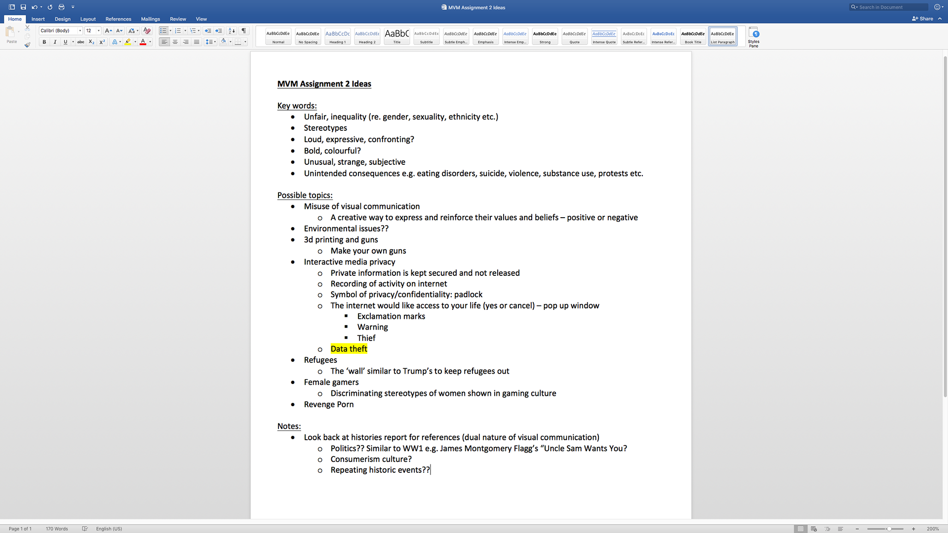
The Word document that was created to keep ideas together for this assignment. I looked at a number of articles, including 3D printing and gun, revenge porn, refugees, female gamers etc.
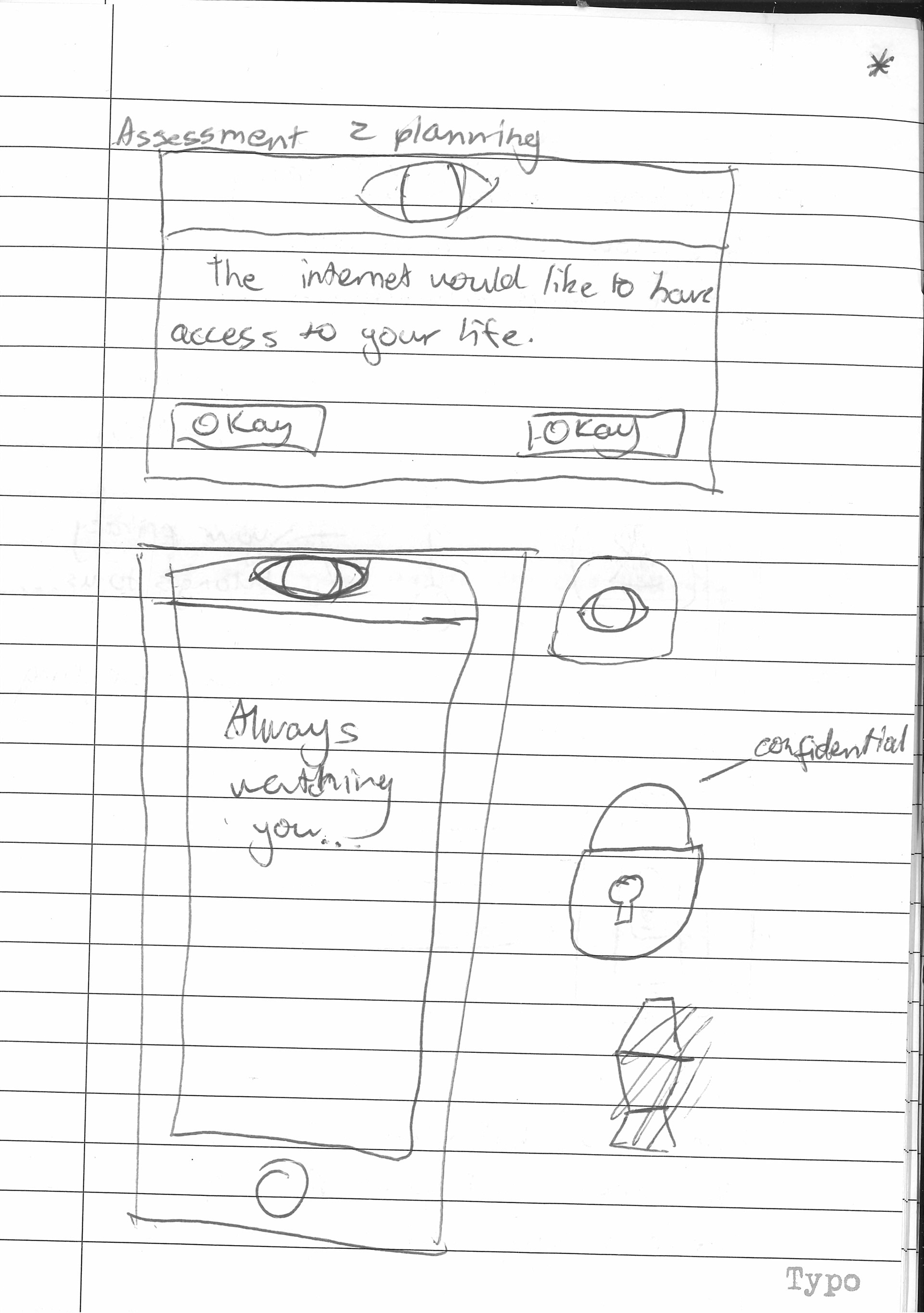
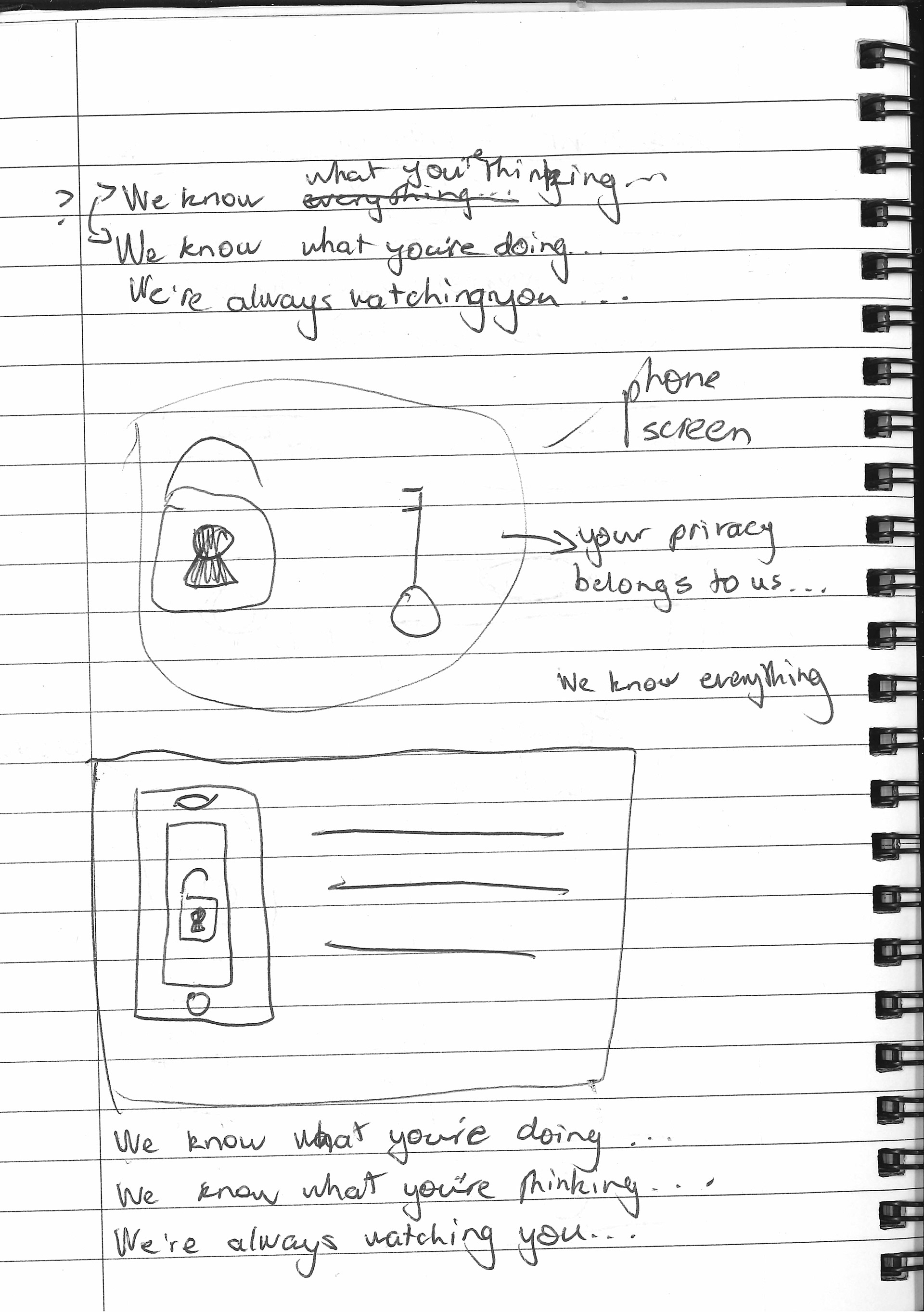
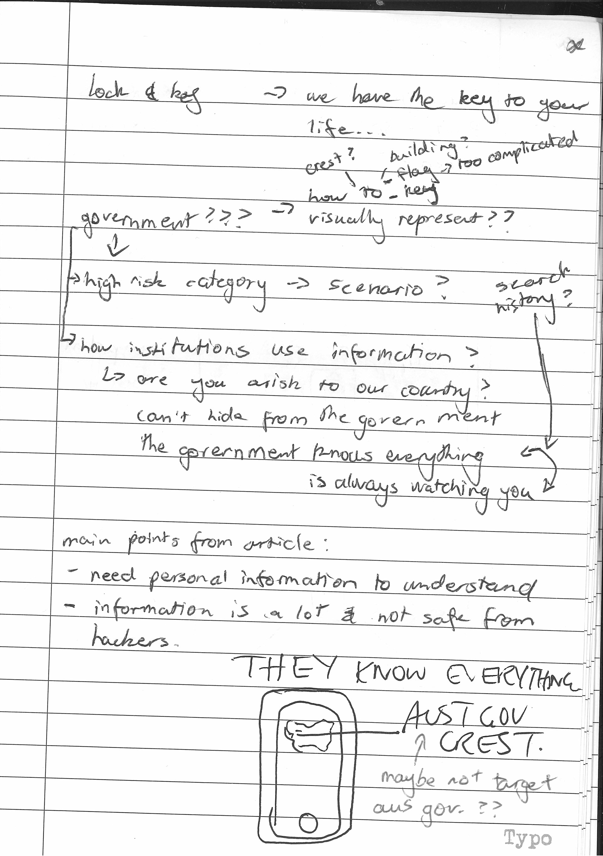
Scanned notebook pages that were used for planning the design of the stencil
Process
Using my planning, I began to create my first version of the stencil design as a pop-up window, however, this idea was quickly scrapped because I realised there was going to be a lot of text, which would not only require numerous bridges, but also would be hard to spray paint after laser printing. The incomplete first version of the stencil is shown below.
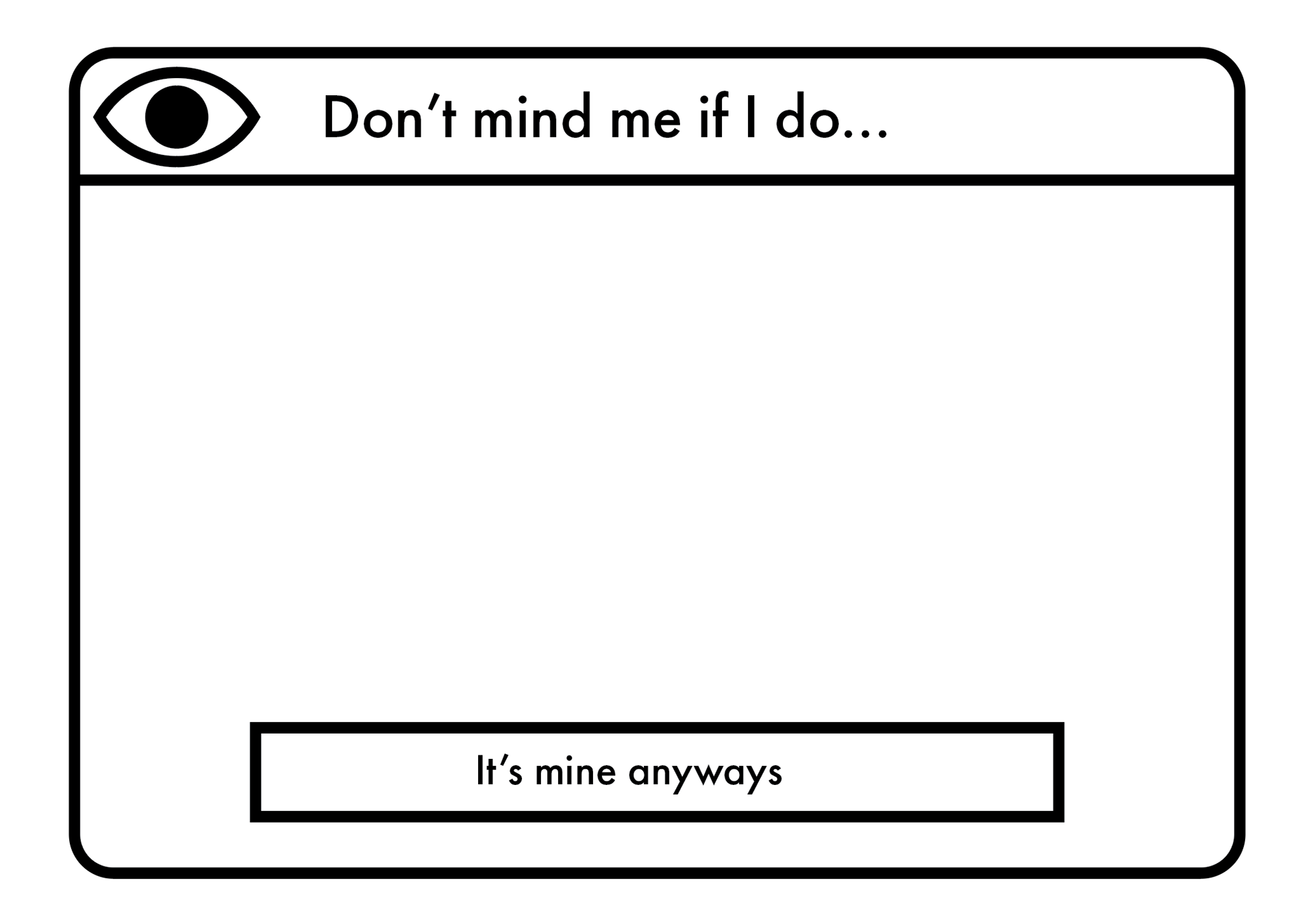
Version 1 of the incomplete stencil design depicting a pop-up window asking for 'permission' to view the user's personal data
My next idea moved onto the phone with an eye in place of the camera with the confronting message on the phone screen with another eye. This (second) version was presented in class for critique as shown below. I also had time to practise creating bridges in the letters as well as the design which was implemented in the second design. In class, my peers commented that the bigger eye on the phone screen was unnecessary, but the smaller eye for the camera was a good idea. At this point, I realised that I wanted to do more with this design because I felt that this design was 'too simple' and it addresses the issue on a basic and generic level. As such, I decided to start again, but I knew I wanted to keep the message and the phone with the eye-camera in the next version.
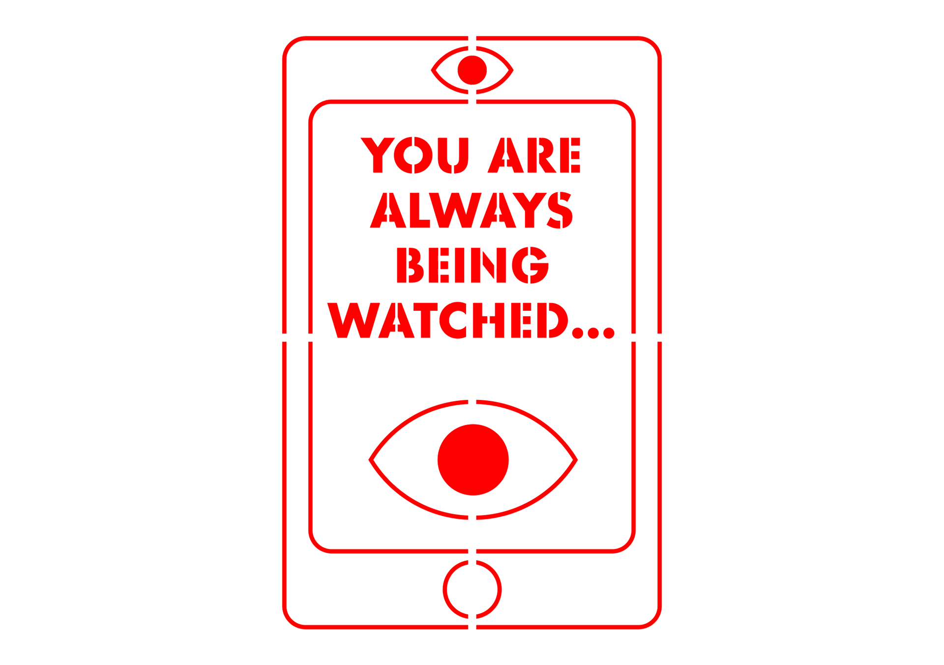
Version 2 of the stencil design with bridges which was shown for critique in class. It shows an iPhone with eyes for the camera and on the screen with an intimate and inappropriate message.
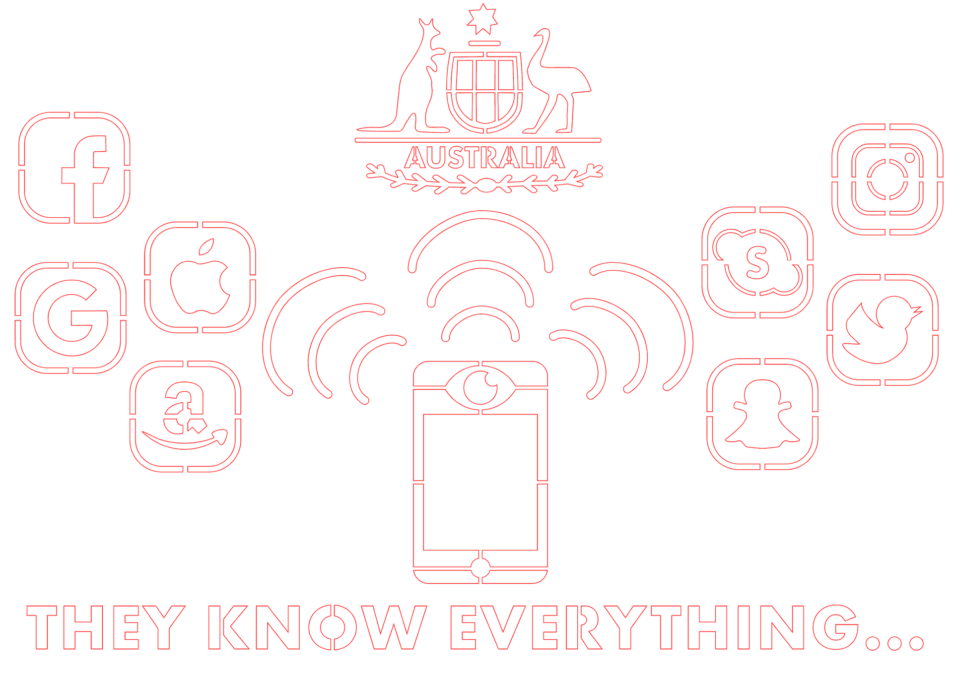
The third version of the stencil design came about as I was experimenting with icons for businesses, the government and social media. I wanted to incorporate these into my design somehow as the government isn't the only ones viewing and sharing our personal data. As such, the below design was created with the same phone and message, but with three separate wi-fi signals extending from the phone to 3 different receivers (businesses, government and social media.
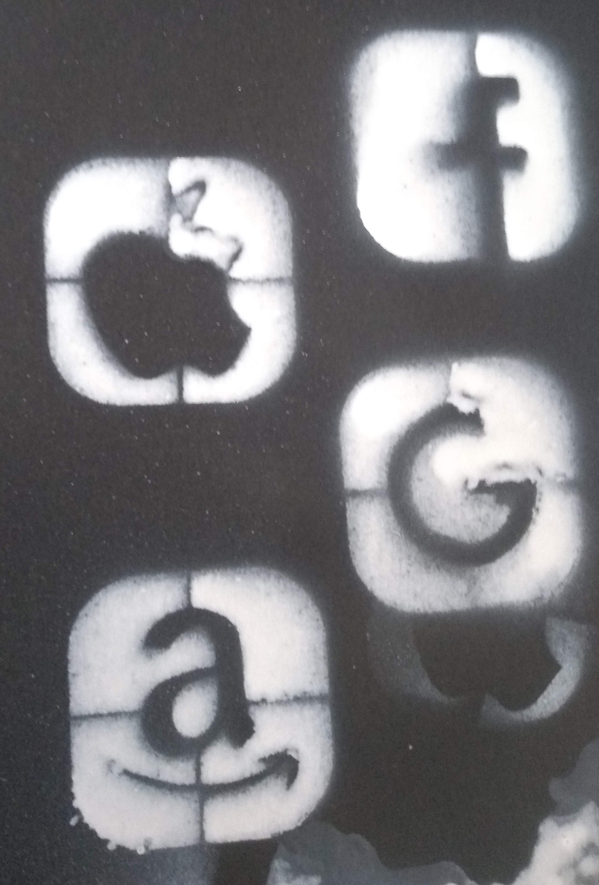
Businesses were represented with money because businesses are always trying to maximise the profit they earn by advertising their products and services to several people; one sure way to attract consumers is to utilise user data to create personalised advertisements online. The government was represented with a gavel as these were commonly seen in court; initially I was going to create a simplified version of the Australian Government logo but I decided not to because I was worried about how my design would be received in the exhibition with the Australia Government logo. Lastly, social media was represented by logos of popular social media platforms, such as Facebook, Instagram, Twitter and Snapchat. These icons were created using basic shapes and the curvature tool with the actual logos used as reference.
Some time during that week, I was having a conversation with a friend and he recommended to include Google as a social media/corporation that collects data. After looking it up for myself, I found that Google is one of the big companies (the other being Facebook) store and have access to user information while distributing it to other companies in order to generate personalised advertisements. The fourth version is shown below Version 3 with the inclusion if the Google logo and other minor changes.
I was happier with this approach because I felt this this depicted the issue of interactive media privacy on the confronting and direct level that I wanted to achieve.
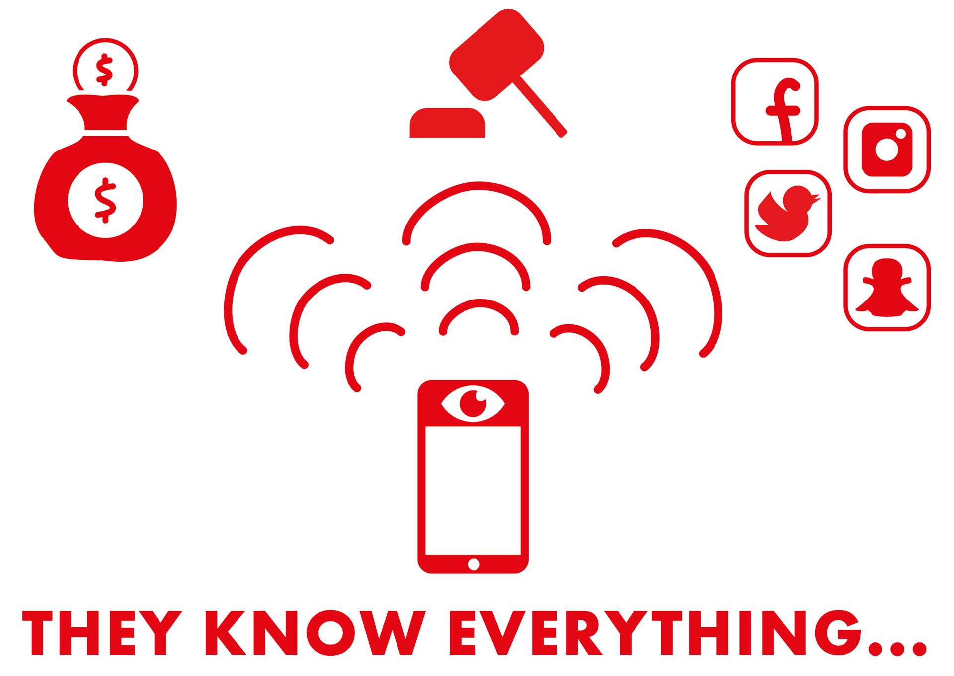
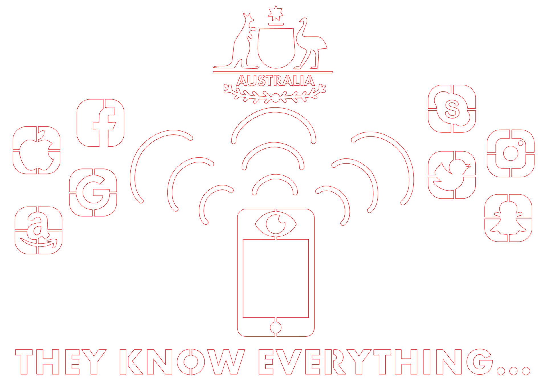
Version 3 of the stencil design depicting the user's personal data sent to corporates and shareholders (money bag), governments (gavel) and social media (app icons) from our mobile phones.
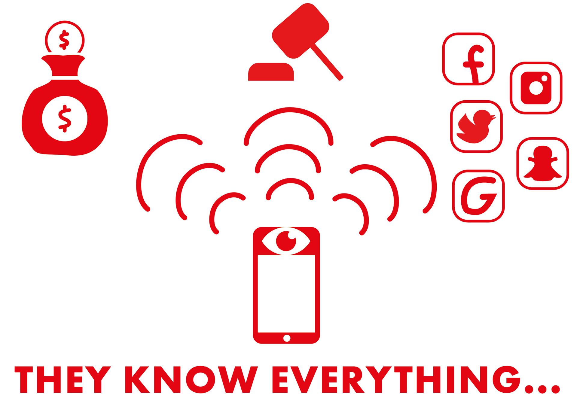
Version 4 of the stencil design. Minor changes were made to Version 3, and another social media icon was added -'Google'.
In class next week, I sought out more feedback from my tutor regarding my design. She suggested to re-do the Facebook and Google icons because they don't look like them and it might confuse the viewers. She also said to change the money bag to icons of corporate logos known to use and share user data. Additionally, she recommended to create the simplified version of the Australian Government logo instead of the gavel as it is a recognisable logo in Australia, and it won't be criticised by viewers.
These changes were made later after some research on corporates as shown below in Version 5 and I'm quite happy with how it turned out. Facebook and Goole was moved to the corporations side and Skype was created with the other social media icons. An article by Angela Chen showed that Google, Facebook, Apple and Amazon are big corporations that view and sells user data, while another interesting article by Katherine Schwab stated that PayPal is another big corporation that uses and shares user data. The Apple, Facebook, Google and Amazon icons were created by using the curvature tool to trace over the actual logos. A PayPal logo was also created using the text tool, however I decided to not include PayPal because I haven't found other articles negatively stating that PayPal is viewing and sharing user data.
Please note that the stoke outline of this design was set to 0.5 for visibility on Behance.
Version 5 of the stencil design with the bridges. Note: the stroke was set to 0.5 for visibility.
Version 5 was sent to the laser printer and I was really happy about how it turned out on the cardboard as a stencil. Nothing fell out and all the pieces stayed which I was happy about. One thing that I was a bit worried about was the eye and the phone screen was balancing on one thin bridge and I was worried that it would fall of during the transit home. Thankfully, it didn't, and I was able to start spray painting at home.
As someone who has never use spray paint before, I struggled with this part a lot because I couldn't get clean, crisp lines and the spray paint blurred together, particularly in the background of the corporate and social media icons. Overall, I was unhappy with the spray paint outcome and decided to re-do all the icons and re-print the stencil.
The cardboard stencil of the Version 5 design laser-printed on a piece of cardboard. It was placed on a black piece of paper before spray painted.
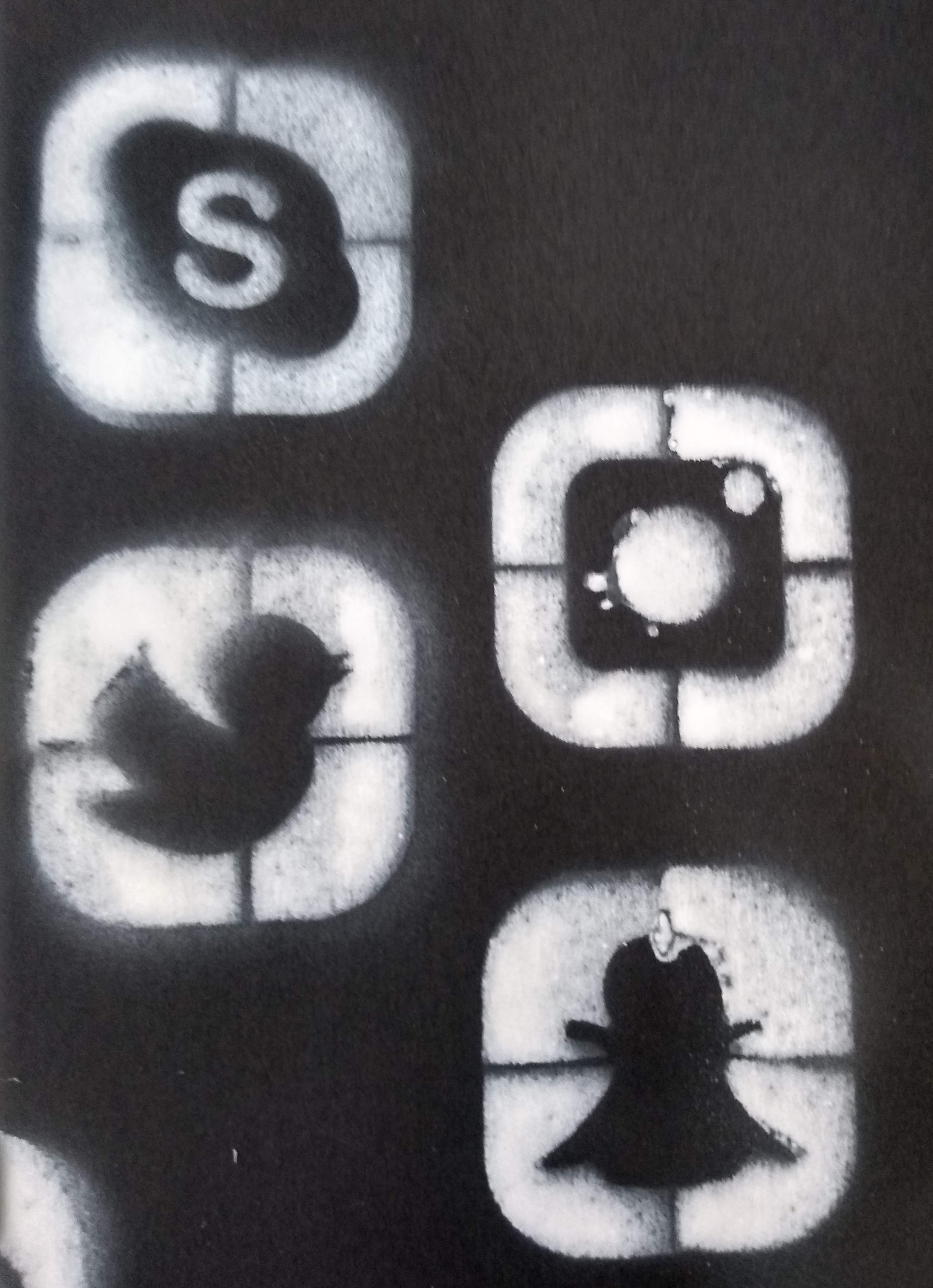
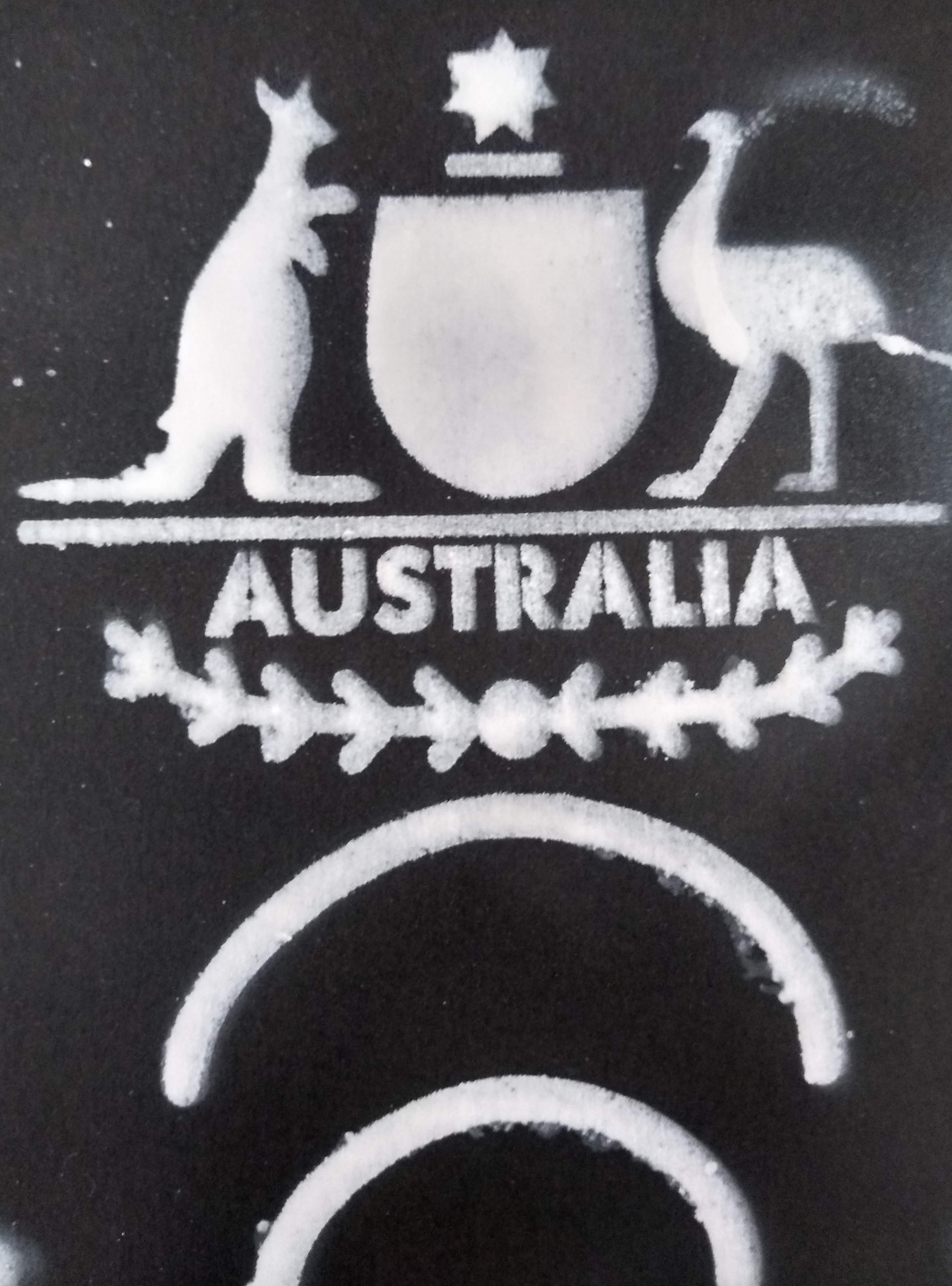
Close up photos of the Version 5 stencil spray painted.
Redo of Stencil Process, Laser Print & Spray Paint
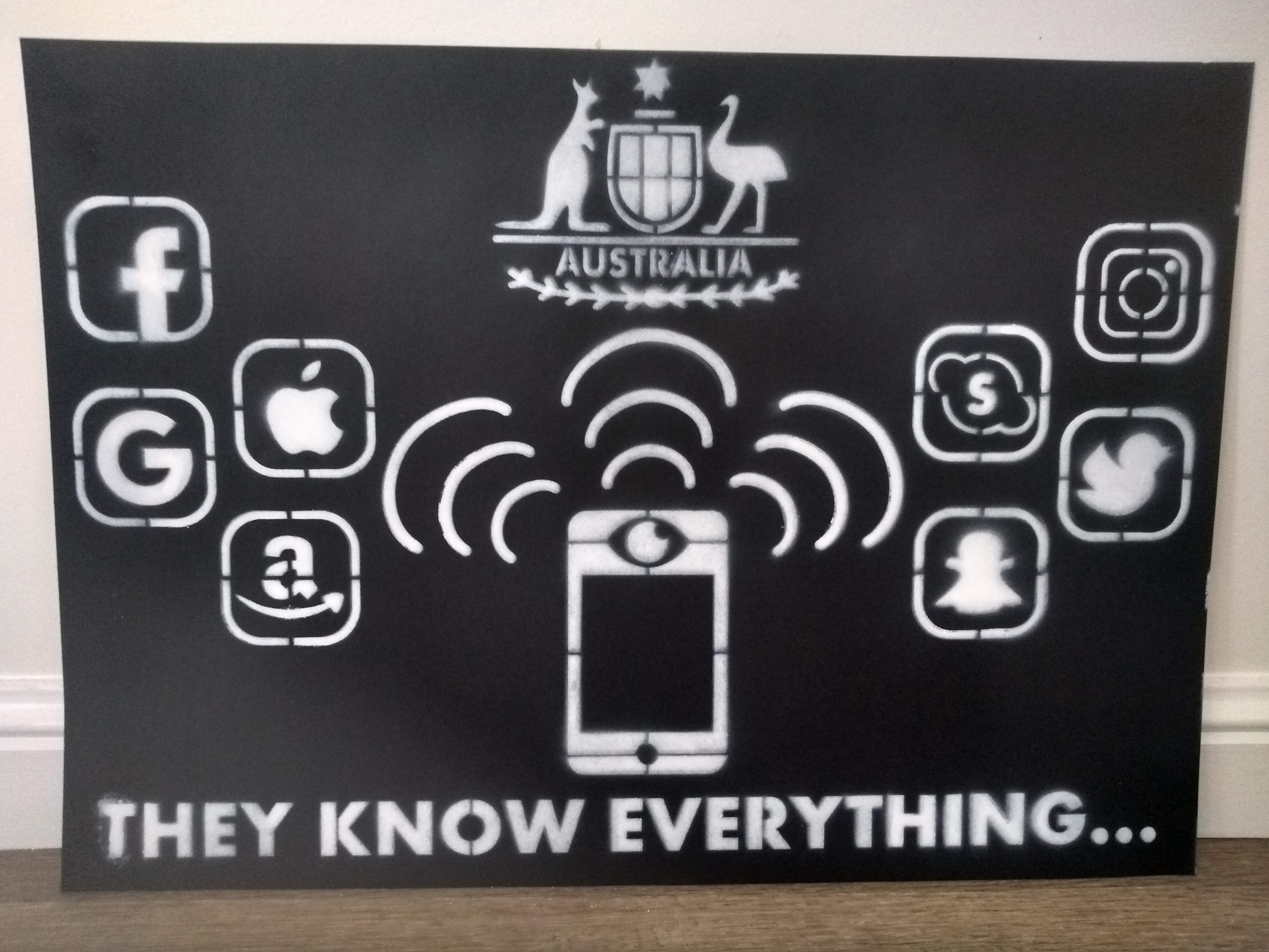
Version 6 (the final iteration of the stencil design) shows all the icons re-made to have a border instead of the background spray painted, and the icons would be cut out and spray painted. More detail was added to the Australian Government logo shield to represent the six Australian States, and additional bridges were added to the phone and its eye-camera for stability during transit. Other minor changes were made, including shrinking the size of the wi-fi signals and enlarging the corporate, government and social media icons.
Please note once again that the stoke outline was set to 0.5 for visibility on Behance.
Version 6 of the stencil design with all bridges. Note: the stoke was set to 0.5 for visibility
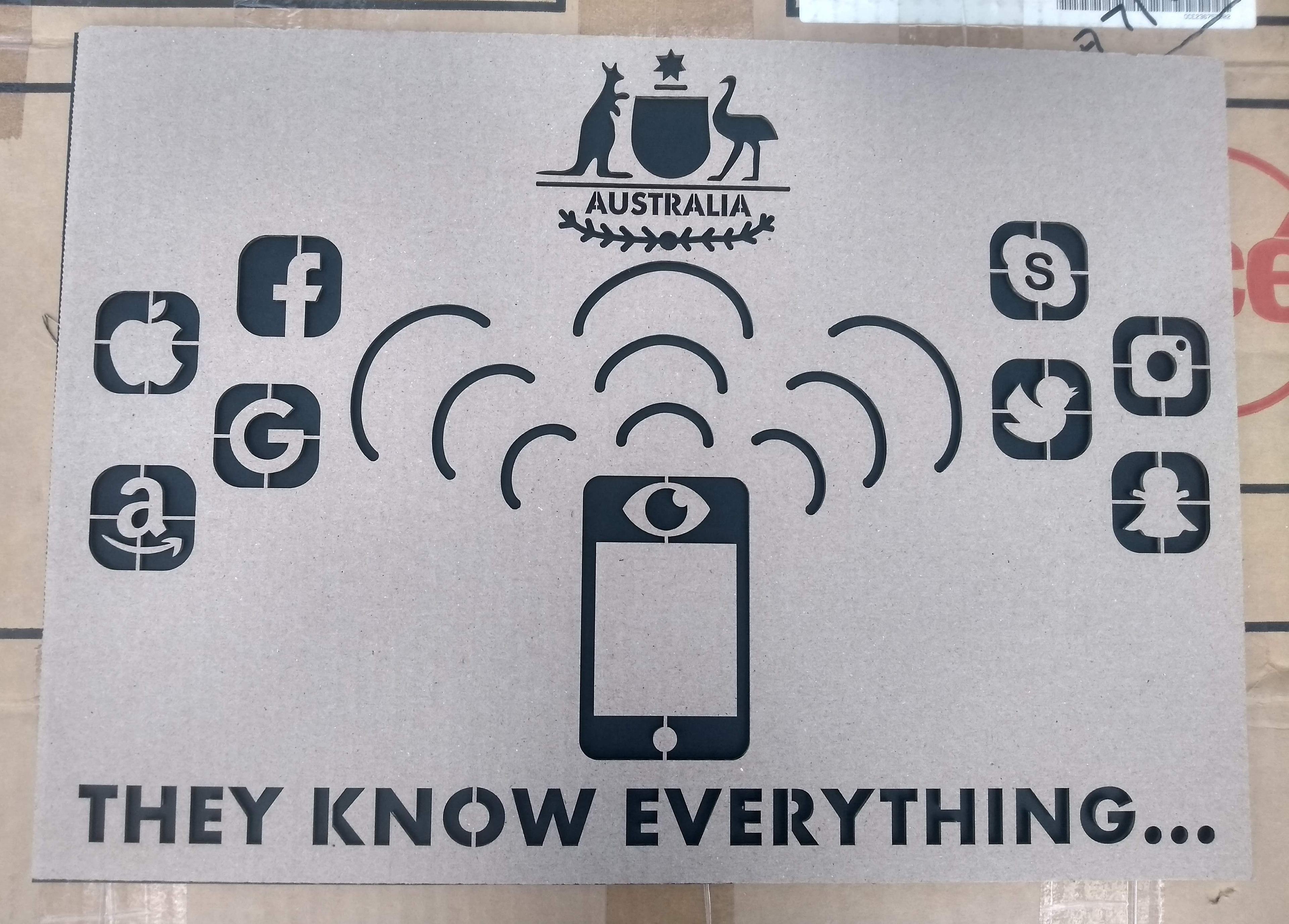
The design was re-printed at university and I was happy with how it turned out -nothing fell out again and the phone parts were stable this time.
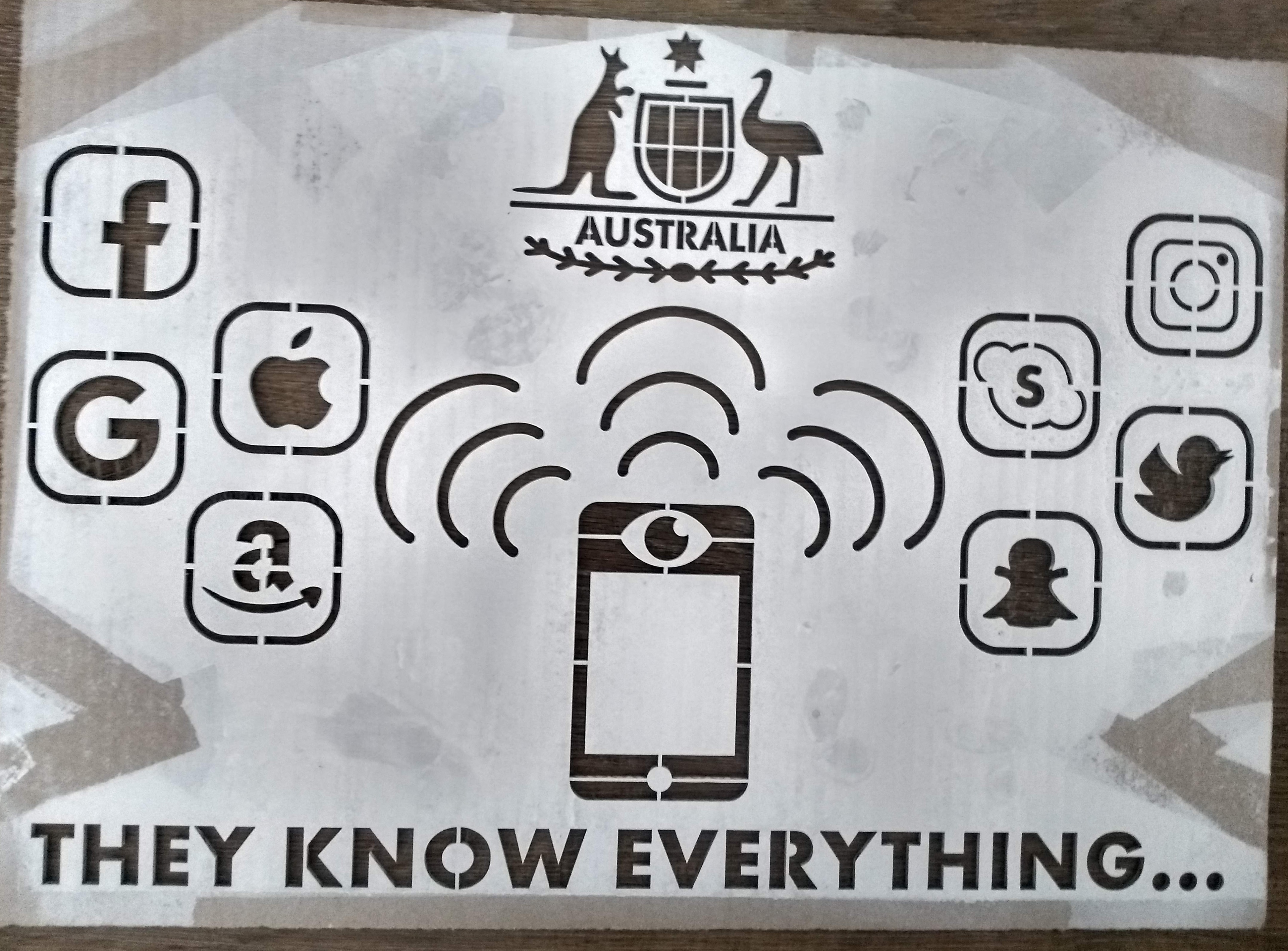
The cardboard stencil of the Version 6 design laser-printed on another piece of cardboard. The photo above show it after it was used for spray painting.
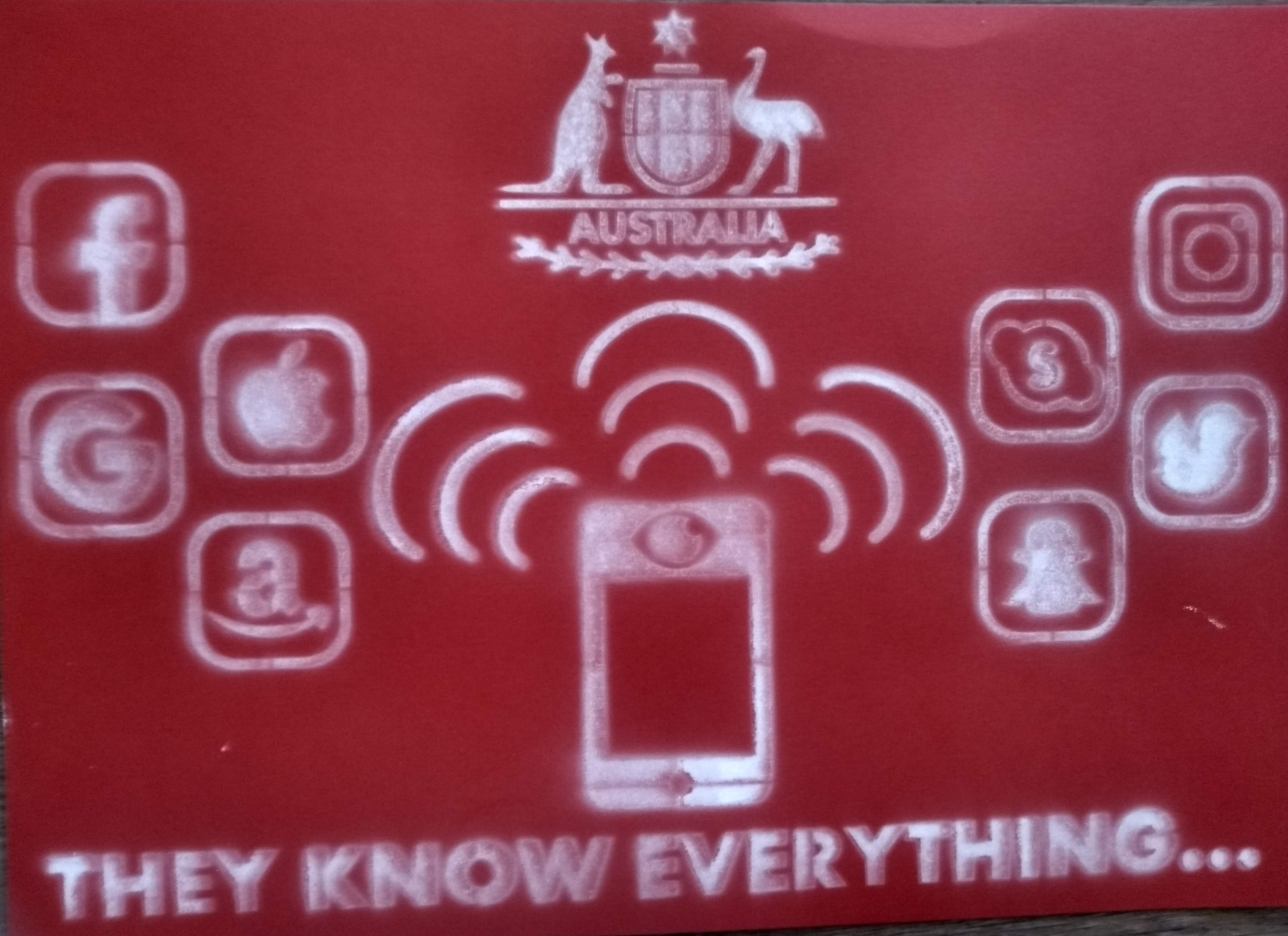
I decided to spray paint the stencil onto a red piece of paper to see how it would turn out, however, the spray paint didn't seem to dry properly on the paper and it bled through it, even though it is the same GSM, as the black paper used for the first stencil. I bought another black piece of paper that I used for the first stencil and I was happy with how the spray paint outcome turned out this time (save for some of the fuzzy lines and the letter 'T'); this is the outcome that I submitted for assessment. Overall, I have quite happy with how this piece turned out as I believe it communicated the message of the Interactive Media Policy article well and my understanding of it in a confronting manner.
Left: The spray paint outcome on a red piece of paper full view
Right: A close up of the back of the paper showing the paint bleed through.
The final spray painted stencil design on a black piece of cardboard submitted for assessment.
References
Baruh, Lemi. “Read at Your Own Risk: Shrinkage of Privacy and Interactive Media.” New Media & Society 9, no. 2 (April 2007): 187–211. doi:10.1177/1461444807072220.
Chen, Angela. "Making big tech companies share data could do more good than breaking them up" (2019). MIT Technology Review. Accessed November 4, 2019. https://www.technologyreview.com/s/613629/making-big-tech-companies-share-data-could-do-more-good-than-breaking-them-up/.
"Data Never Sleeps 5.0" (2017). Accessed November 6, 2019. https://www.domo.com/learn/data-never-sleeps-5.
Melendez, Steven and A. Pasternack. "Here are the data brokers quietly buying and selling your personal information" (2019). Fast Company. Accessed November 5, 2019. https://www.fastcompany.com/90310803/here-are-the-data-brokers-quietly-buying-and-selling-your-personal-information.
Powell, Dominic. 2018. "How “creepy” is your marketing? Nearly 40% of Aussie brands admit their advertising is too personalised." SmartCompany. Accessed November 11, 2019. https://www.smartcompany.com.au/marketing/how-creepy-is-your-marketing-nearly-40-of-aussie-brands-admit-their-advertising-is-too-personalised/.
Sugrue, Chris. 2017. "Why personalised advertising is your lifeline in an age of ad-blockers." The Drum. Accessed November 11, 2019. https://www.thedrum.com/news/2017/08/30/why-personalised-advertising-your-lifeline-age-ad-blockers.